2015 Urban Congestion Trends
Communicating Improved Operations with Big Data
Printable Version [PDF, 3.3 MB]
You may need the Adobe® Reader® to view the PDFs on this page.
Contact Information: OperationsFeedback@dot.gov
(left to right: Photo by: TTI; Photo by: TTI; Photo by: cleanfotos / Shutterstock.com)

The FHWA 2015 Urban Congestion Trends Report provides the current state of congestion and reliability in the largest urban areas in the United States. This report also highlights relevant successful operational strategies and performance management approaches implemented by state and local transportation agencies.
The graphic at right provides year-to-year congestion trends from 2014 to 2015 from data that inform FHWA's Urban Congestion Report (UCR). Overall, congestion has slightly decreased from 2014 to 2015. Hours of congestion declined by 23 minutes from 5:03 (2014) to 4:40 (2015) and the planning time index declined slightly from 2.68 (2014) to 2.65 (2015). The travel time index increased one point from 1.33 (2014) to 1.34 (2015).
This report marks the second year of calculating congestion and reliability metrics with the National Performance Management Research Data Set (NPMRDS). "Big Data" is a popular term used to describe the massive amounts of data being produced in this connected age. These large data sets often require advanced analytical tools to process the data into information for decision making. NPMRDS is an example of a big data source — created from vehicles on the transportation system. It includes actual, observed travel times on the National Highway System (NHS) and is available for use by state departments of transportation (DOTs) and metropolitan planning organizations (MPOs) for their performance management activities. This report documents several examples from state and local agencies using NPMRDS to better understand how their transportation system is operating.
Operational strategies provide proven methods for improving the performance of the transportation system, whether through reducing congestion, improving reliability, or creating options for travelers. Operational strategies often result in other benefits such as increased safety and improved environmental outcomes (e.g., reduced greenhouse gas emissions). This report includes highlights of innovative ways states and local agencies throughout the United States have implemented effective operations and measured the impacts of congestion. The report concludes with a discussion of the importance of traffic volume data when aggregating performance measures.
Urban Congestion Trends
Year-to-Year Congestion Trends in the United States (2014 to 2015)
NOTES
The results in this map are annual congestion trends. Quarterly UCR data are available here: https://ops.fhwa.dot.gov/perf_measurement/ucr/.
Each symbol ( ) represents 1 metropolitan statistical area (MSA).
Congestion Facts
- From 2014 to 2015, the congestion measures either decreased (daily hours of congestion, worst-trip time penalty) or increased slightly (time penalty for each trip).
- All three measures improved in 35 percent (18) of the MSAs.
- All three measures had no change in 63 percent (33) of the MSAs.
- All three measures worsened in only 2 percent (1) of the MSAs.
- The time penalty for a trip on an average day decreased or remained unchanged in 67 percent (35) of the MSAs.
- Travel time on the worst day per month decreased or remained unchanged in 75 percent (39) of the MSAs.
Congestion Measure Definitions
- Hours of congestion—amount of time when freeways operate less than 90 percent of free-flow freeway speeds.
- Travel Time Index (TTI)—time penalty for a trip on an average day. A TTI of 1.30 indicates a 20-minute free-flow trip takes 26 minutes (20 × 1.30) in the rush hours.
- Planning Time Index (PTI)—time penalty for a trip to be on time for 95 percent of trips (i.e., late for work on one day per month). A PTI of 1.60 indicates a 20-minute free-flow trip takes more than 32 minutes (20 × 1.60) one day per month.
- Dashed lines indicate Interstates only.
- Solid lines indicate Interstates and other freeways and expressways.
Previous year's performance measures have been updated using the most recently available (2013) national volume data.
Using Big Data for Transportation System Monitoring
Who Is Using NPMRDS Data?
FHWA has made the NPMRDS data set available to state DOTs and MPOs to use for performance management activities to facilitate the application of performance measures. Because of this, many state and local transportation agencies are using the NPMRDS to compute performance measures and evaluate the transportation system. Three examples are provided here from the Maricopa Association of Governments (MAG), Chicago Metropolitan Agency for Planning (CMAP), and the Florida Department of Transportation (FDOT).
Maricopa Association of Governments — Phoenix, Arizona
The MAG Regional Transportation Plan includes a performance-based planning and programming process as set forth in Arizona legislation. The plan addresses freeways and other highways, streets, transit, airports, bicycle and pedestrian facilities, freight, demand management, system management, and safety.
MAG staff evaluated the NPMRDS as an additional data source for their performance-based activities. NPMRDS data have been used to investigate detailed congestion profiles, day-by-day monitoring capability on the NHS (see graphic), and investigation of reliability measures. MAG has found that NPMRDS:
- Is a useful add-in data set for planning, operations, and programming studies;
- Is consistent with third party archived historical speed data; and
- Enhances MAG’s capability to monitor/measure traffic variability and reliability.
MAG continues to work on ways to incorporate NPMRDS into MAG congestion monitoring routines.
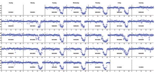
Day-to-day variability monitoring of a month of data using NPMRDS data.
For more information:
Monique de los Rios-Urban, MAG, mdelos@azmag.gov
Wang Zhang, MAG, wzhang@azmag.gov
http://performance.azmag.gov/Files/Tools_for_MAGnitude_1-5-15.pdf
Chicago Metropolitan Agency for Planning (CMAP) — Chicago, Illinois
Regional mobility is a major emphasis of Metropolitan Chicago’s GO TO 2040 comprehensive plan, which CMAP and its partners are working to implement. The region must invest wisely because it cannot build its way out of congestion, which costs more than $7 billion each year in lost fuel and productivity. Performance-based funding will enable transparent, data-driven investment decisions and consistent collaboration among stakeholders. CMAP is using NPMRDS data as a component to assist with measuring and comparing needs on their regional transportation system.
CMAP is using NPMRDS to set goals and standards, detect and correct problems, manage, describe, and improve processes, and document accomplishments. NPMRDS-derived measures are being used as a component in computing a "Need Score" (see graphic) that assists in the identification of locations where investment should be prioritized based on planning factors. Additionally, using NPMRDS archived data, CMAP has produced a website that shows an animation of highway speeds by time-of-day to help the public visualize the transportation system in the Chicago area.
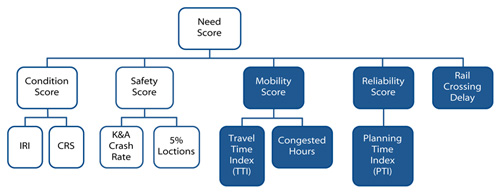
An illustration of the Need Score with NPMRDS-dependent components shaded.
For more information:
Tom Murtha, CMAP, tmurtha@cmap.illinois.gov
http://www.cmap.illinois.gov/mobility/roads/cmp
Florida Department of Transportation (FDOT) — Miami Area
FDOT District 4 Planning and Environmental Management Office is using NPMRDS data in South Florida to analyze travel times along pre-defined corridors and determine origin-destination travel time variability in response to a citizen request.
For the study, staff investigated time-of-day commute times along a 25-mile corridor of the Ronald Regan Turnpike in Dade County. Travel time data were averaged from all Wednesdays in October 2013 to conduct the analysis. Resulting data were tabulated for the AM commute for each 15-minute time interval. The analysis shows that leaving 15 minutes earlier, in this case at 6:30 instead of 6:45, may reduce almost 50 percent of the traveler’s commute time in the morning (see graphic).
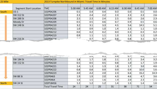
Use of NPMRDS to compute trip travel time by time-of-departure.
For more information:
Min-Tang Li, FDOT, min-tang.li@dot.state.fl.us
NPMRDS Webinar, November 3, 2015, https://ops.fhwa.dot.gov/Freight/freight_analysis/perform_meas/index.htm
Operational Improvement Evaluations – Using Big Data for Improved Operations
The evaluations that follow highlight innovative ways that states and communities throughout the United States have reduced congestion through effective operations.
Work Zone Corridor-Based Project Coordination — Michigan Department of Transportation
Work Zone Corridor Coordination — Agency coordination and planning of work zone activities to minimize impacts on travelers
(Benefits: reduced delay in work zones, reduced frustration, reduced emissions).
The Investment
Michigan's I-94 corridor is a major thoroughfare extending 271 miles across the state from Indiana to Canada. The corridor travels through 3 Michigan DOT regions and 9 counties. In 2010, 19 consecutive construction projects on the corridor led to lengthy delays that resulted in creation of the One Corridor Focus initiative led by the Corridor Operations Partnership (COP). The mission of COP was to improve traffic operations and system reliability along the I-94 corridor statewide with the objectives of 1) unification of the I-94 corridor with one focus and 2) 40-minute delay maximum for the entire corridor (travel reliability).
The Return
The active corridor management has resulted in improved performance of individual work zones, coordinated effort for corridor projects, and the sharing of challenges, solutions, and best practices. Michigan DOT monitors the user delay cost (UDC) as a performance measure to monitor effectiveness. The graphic shows a sample from the Michigan DOT Southwest Region of weekly UDC results including weeks that are above and below average. Southwest Region holds a weekly work zone meeting to discuss upcoming impactful work and coordinate messaging. Limiting delays through all work zones to less than 10 minutes for 90 percent of days in each work zone was in place during the 2015 construction season.
For More Information:
Steve Brink, Michigan DOT, BrinkS1@michigan.gov
https://www.workzonesafety.org/files/documents/SWZ/webinar3_slides.pdf
Variable Speed Active Traffic Management System — Portland, Oregon
Variable Speed Active Traffic Management System — Adjusting speeds based upon traffic levels and weather conditions to harmonize corridor speeds
(Benefits: reduced delay, increased reliability, improved safety).
The Investment
Oregon Route 217 is a 7.5-mile limited-access expressway in the Portland, Oregon, area. Due to limited funding for large capacity improvements, the Oregon Department of Transportation implemented a variable speed active traffic management (ATM) system along the corridor. Improvements included variable advisory speeds based on current congestion and weather conditions, variable message signs on the freeway and surface streets to provide real-time travel time estimates and queue warnings, and isolated shoulder widening for disabled vehicles.
The Return
Preliminary results of the variable speed ATM include:
- 21 percent reduction in corridor crash-related incidents;
- 10 percent reduction in travel time variability (see graphic);
- 5 percent increase in vehicle throughput; and
- Curve Warning System based on weather has decreased crash frequency by 50 percent.
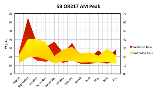
Before and after travel time reliability, SB OR-217 Morning Peak
For More Information:
Dennis Mitchell, Oregon DOT, dennis.j.mitchell@odot.state.or.us
http://www.oregon.gov/ODOT/HWY/TRAFFIC-ROADWAY/docs/pdf/2015_conference/2015_Mitchell.pdf
Freeway and Arterial System of Transportation (FAST) — Las Vegas, Nevada
Performance Monitoring and Measurement System — Integrating data from a variety of sources and presenting it in a variety of user-friendly ways for instruction and decision making
(Benefits: reduced time to process reports, facilitated decision making, program and project evaluation).
The Investment
The Freeway and Arterial System of Transportation (FAST) of the Regional Transportation Commission of Southern Nevada (RTC) monitors and controls traffic in the Las Vegas, Nevada, metropolitan area. FAST operates the entire freeway network through an agreement with the Nevada DOT. Throughout the Las Vegas metropolitan area, RTC/FAST and Nevada DOT have installed intelligent transportation system (ITS) equipment along the freeway.
The Return
Since 2009, the FAST dashboard has been widely applied in day-to-day operations, incident management, express lane evaluation, ramp meter operation and evaluation, ITS device maintenance, and operation data quality control. The system facilitates coordination with other transportation fields by providing information to the planning and transit departments. In mere minutes, a weekly or monthly congestion report for a selected corridor can be generated. The FAST dashboard has been used extensively to:
- Convey live traffic information to the public;
- Download traffic counts;
- Generate graphs and plots;
- Present improvements for decision making; and
- Monitor ITS device health.
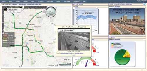
FAST Performance System Dashboard
For More Information:
Gang Xie, RTCSN, XieG@rtcsnv.com
http://bugatti.nvfast.org/Default.aspx
http://trrjournalonline.trb.org/doi/pdf/10.3141/2271-06
Advanced Construction Traveler Information System — I-35 in Central Texas
Advanced Construction Traveler Information System — Updates public on major corridor construction and improves safety
(Benefits: reduced delay, increased safety).
The Investment
The Texas Department of Transportation (TxDOT) is currently undertaking a $2 billion reconstruction of nearly 100 miles of I-35 in central Texas. The Interstate will be expanded to six lanes in rural areas and eight lanes in urban areas with continuous one-way frontage roads. TxDOT is using an advanced construction traveler information system to keep the public informed and enhance safety and mobility during the multiple years of construction. A number of operational and institutional elements were implemented, including:
- Corridor-wide ITS equipment (using solar and cellular technologies);
- Travel time monitoring and display;
- End-of-queue (EOQ) warning system; and
- Contractor coordination.
The Return
A number of benefits have resulted from the advanced construction traveler information system, including:
- Less than 5 percent of closures result in delays more than 30 minutes (2,800+ closures to date);
- 87 percent of users think information is nearly always accurate;
- 62 percent of travelers have changed plans based on the traveler information (see graphic for sample); and
- A 20 to 40 percent reduction in crashes over what would have occurred if the EOQ system was not in place.
For More Information:
Bob Brydia, Texas A&M Transportation Institute, r-brydia@tti.tamu.edu
https://www.workzonesafety.org/files/documents/SWZ/webinar3_slides.pdf
Performance Management and Operations
Why Are Traffic Volume Data Important for Performance Measurement Calculation?
Not all roads are the same. Speeds tell us the operating condition of the roadway, while volume tells us how many vehicles are impacted by that travel speed.
Below is an example illustration of why volumes are important when summarizing mobility statistics. The graphic below shows an 8-lane segment with an average daily traffic (ADT) of 200,000 traveling at 25 mph and a 4-lane segment with an ADT of 80,000 traveling at 50 mph. What is the average speed of these two segments?
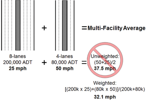
ADT=Average Daily Traffic
If a simple average is taken, this ignores the much different traffic volume on each facility, and the greater number of people affected by the slower speed. As shown in this graphic, a simple average of the speeds results in a speed of 37.5 mph. It is always desirable to avoid unweighted calculations in congestion analyses. When aggregating performance measures, analysts should weight measures with volume or vehicle-miles of travel (VMT). As shown in the graphic above, the weighted average speed is 32.1 mph.
How Are Traffic Volume Data Included in UCR?
It is rather common in the UCR metropolitan areas to compute performance measures on roadways with a different number of lanes (and subsequently different volumes) as shown in the example above. That is why the travel times are combined with an associated volume data element prior to computing the performance measures.
The UCR uses VMT to weight the travel time index and planning time index values up to a citywide value.
Contact Information
For more information on this report, contact Rich Taylor (Rich.Taylor@dot.gov).
Visit the Urban Congestion Report website for quarterly congestion trend updates:
www.ops.fhwa.dot.gov/perf_measurement/ucr/index.htm.
FHWA-HOP-16-032